Development of Typographic Glassware
A computer rendering of glass forms built from profiles taken from Helvetica
Typography is everywhere. It’s the way letters look.
“The stretch of time between when you wake up, and when you first interact with some piece of type that someone has drawn, is probably only a couple of seconds.”
If you’re like me, then the first characters you see every day are on your alarm clock or phone alarm (numbers count too)
Can you go a full day without typography?
You would have to avoid all clocks with numbers, any household appliance with a label: no food packaging (so definitely no coffee), no phone, computer, or reading of any kind. Even if you managed to rid your house of any letters, there’s such a constant onslaught of information, that you wouldn’t even be able to go outside without accidentally seeing a car drive with a logo or a road sign. I’m not sure it’s possible unless you’re blind.
My stove knobs. Can’t use them in the no type game
Can you even go a full day without Helvetica?
This is a question that type designer Cyrus Highsmith of Font Bureau attempted to answer. Helvetica is arguably one of the most used typefaces in the modern world. Filmmaker Gary Hustwit even made a documentary, Helvetica, about the history and use of this typeface that has defined the look of the contemporary, urban landscape (watch the trailer).
Movie still from “Helvetica” shows it saturating cities everywhere, subconsciously absorbed
Simon Garfield’s book about typographic history for the laymen, recounts the unfortunately untrue story of Highsmith’s attempt to get through a day in NYC without seeing or using anything bearing this incomprehensibly ubiquitous Swiss typeface. Garfield fictionally recounts Highsmith struggling to find clothes that didn’t use Helvetica on it’s tags, passing on yogurt with Helvetica labels, and needing to avoid the entire subway system, U.S. dollar bills, credit cards, and TV in the evening.
Unfortunately, it’s not true. Highsmith has never lived in New York City, and his day without Helvetica was strictly a thought experiment. “I think if someone did it totally for real,” he told me, “it would end up with them naked, being chased by the police.”
Although the history of typography is fascinatingly nerdy, my designer-brain has a stream of follow-up questions:
- How engrained are the shapes of these letters in our subconscious?
- We’ve written before about using typography as a metaphor for designing glassware, but how effective is that metaphor?
- Can we build off the subconscious familiarity of typefaces to design glassware that subtly fits into our letter-filled, urban, environment?
- Can we defamiliarize those shapes by rendering them in glass?
- Can we build off the historical baggage typefaces bring with them to, as graphic designer Abbott Miller puts it, “turn historic figures [into] unwitting collaborators?” (Dimensional Typography, 1996)
- Is it appropriate to use these letterforms, originally designed for reading, for a totally different purpose?
Spread from J. Abbott Miller’s Dimensional Typography (1996)
Beatrice Warde’s classic essay, The Crystal Goblet (1930) uses the design of a perfect wine glass as a metaphor for “proper” typography.
You have two goblets before you. One is of solid gold, wrought in the most exquisite patterns. The other is of crystal-clear glass, thin as a bubble, and as transparent. Pour and drink; and according to your choice of goblet, I shall know whether or not you are a connoisseur of wine. For if you have no feelings about wine one way or the other, you will want the sensation of drinking the stuff out of a vessel that may have cost thousands of pounds; but if you are a member of that vanishing tribe, the amateurs of fine vintages, you will choose the crystal, because everything about it is calculated to reveal rather than hide the beautiful thing which it was meant to contain.
-Warde, 1930
Warde’s claim that “typography should be invisible” and only act as a window to content, has proven outdated in contemporary practice, but surprisingly, the design of glassware, and drinking vessels in general, has remained relatively static. Can we turn the metaphor around and use contemporary typography to refine glass design?
Early tracings of Helvetica Bold
Curves from different letters start to get pieced together to create vessels for different beverages
Full scale paper models of the group
Preparing parts for prototype molds
The fins surround the shape of the glass with some room for extra material at the top
The molds are hinged to get the glass in and out
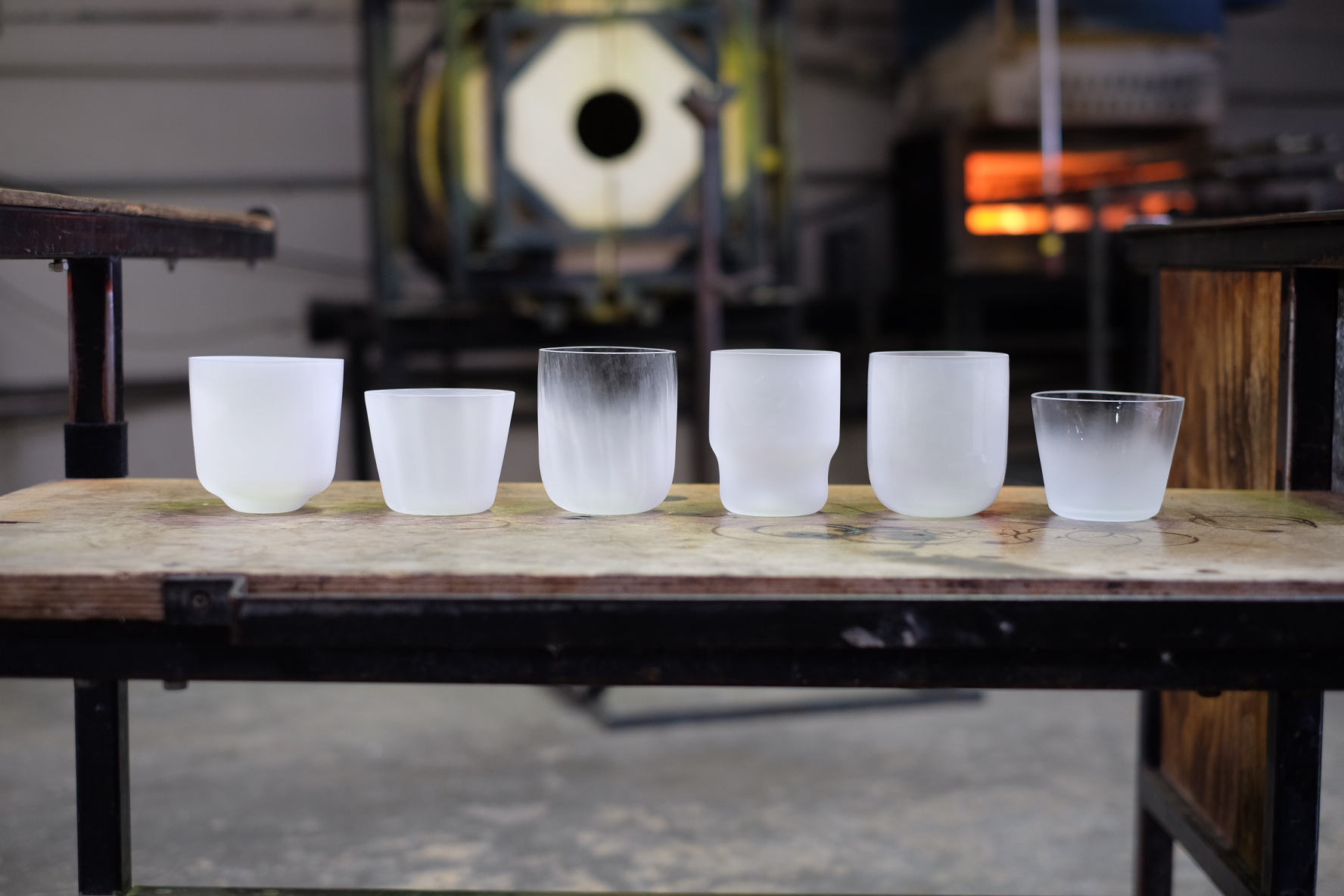
These are some of the questions we are attempting to explore with our new line of typographic glassware and this is only the beginning… We are basing our first set on Helvetica so, will these vessels feel subconsciously familiar? Will they even be recognizable? What other typefaces can we use? If objects like glassware are designed with typography, it might be even harder to escape letterforms. If alphabets borrow forms from the environment and vice versa, where is the line between letters and space?
Blowing glass into the mold provides a precise shape
Finishing the bottom of the glass post-molding
The glasses with the excess glass cut off the tops
Christopher Yamane is an industrial designer and Co-Founder of Super Duper Studio


